 |
Integrated Sustainability Analysis |
 |
| Home Contact Search Media |
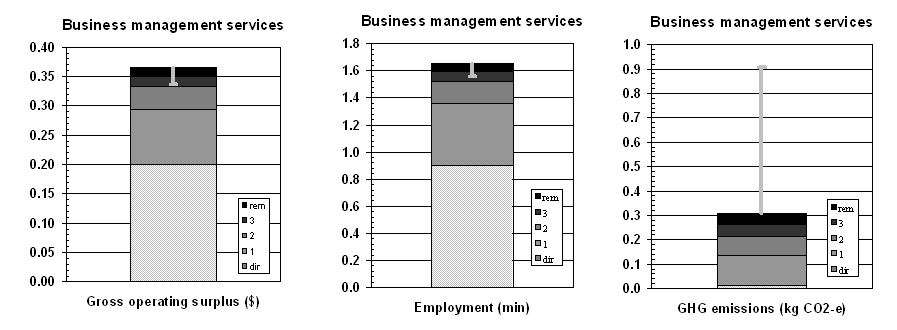
Metrics in TBLIn the ISA / CSIRO framework, TBL indicators are reported against in their appropriate units, and per dollar of final demand, or final output. This way of accounting and reporting allows comparisons and benchmarking across a range of scales. For example, the TBL impacts of a large and a small company of the same sector are likely to differ substantially in absolute terms, but they can be compared when expressed in per-output terms, that is, per dollar of output. Appropriate units for economic TBL indicators such as surplus can be reported as "dollars of surplus per dollar of output". The social indicator of employment would be described as "the minutes of employment generated per dollar of output". The environmental indicator greenhouse gas emissions can be reported on as "kilograms of carbon-dioxide-equivalent per dollar of output". Because these quantities have the common metric of one dollar of output, they can be applied to the financial balance sheets of companies and institutions and thus allow Triple Bottom Line reporting at the company level that is commensurate with sectoral, regional and national reporting. The diagrams below show three TBL accounts for the example of the Australian business management sector. In order to be consistent, all indicators are evaluated in an integrated way, using the same method, and covering the entire upstream supply chain (see the boundary problem). Many more indicators can be depicted as bar graphs. The TBL Reports of this sector on surplus, employment and greenhouse gas emissions is expressed in units of $ of surplus per $ of output, minutes of employment per $ of output, and kg CO2-equivalent per $ of output.
The three bar graphs visualise the total TBL impact in terms of the three TBL indicators. The shaded portions of the bars represent the direct impacts (on-site, in the sector), the first-order impacts (at the suppliers of the sector), second-order impacts (at the suppliers of the suppliers), third-order impacts (at the suppliers of the suppliers of the suppliers), and all remaining higher-order impacts. This type of breakdown is called a production layer decomposition. A production layer diagram gives insights about how "deep" the TBL impacts of a sector or company reach into the economic system. For example, the business management sector generates 20� of surplus for each $ of GNT. The suppliers of the business management sector generate another 9� of surplus, the suppliers of the suppliers another 4�, and so on. The overall surplus generated by consuming the commodity business management is 36 �/$, which is higher than the economy-wide average of 33 �/$. Similar stories can be told for minutes of employment generated, and kilograms of greenhouse gases emitted, and for many more TBL indicators. The third bar graph demonstrates that significant greenhouse gas impacts and associated financial risks for example from a potential carbon tax occur in higher orders of production a comprehensive assessment of the impact of a sector or company is usually not complete until up to 10 production layers are assessed. These higher-order impacts are overlooked in conventional TBL approaches. For further information please contact
|
