 |
Integrated Sustainability Analysis |
 |
| Home Contact Search Media |
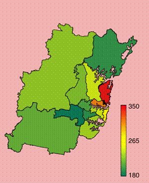
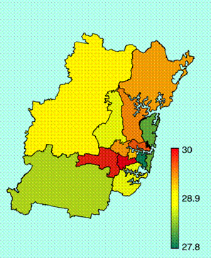
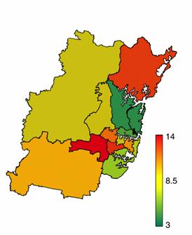
A Sydney Social and Environmental AtlasLiving means consuming, and consuming causes resource depletion and environmental degradation, but also creation of jobs and income. The consumption habits of people across Australia and the world differ substantially, and so do the associated social, environmental and economic impacts. The aim of this draft "Sydney Social and Enviornmental Atlas" is to illustrate the distribution of contributions to social and environmental impacts across the Statistical Subdivisons of the city of Sydney. Some of these contributions to social and environmental impacts arise from activities associated directly with the household. These are, for example, the employment of household members, the consumption of fuels and water in the house, or the consumption of petrol through driving a private vehicle. The resources needed and pollutants emitted by households are called direct requirements. Sydney households also cause social and environmental impacts indirectly through the consumption of goods and services. The corresponding resources and pollutants needed to satisfy consumer demand are called indirect requirements. These indirect requirements occur in the numerous producing industries of the Australian as well as overseas economies. However, they are ultimately being demanded by the households. Indirect requirements shall here be understood as of infinite order. This means that they, in the case of the provision of a train journey for example, not only include impacts (energy, jobs, emissions) associated with the very train journey, but also through assembling the train and running the stations, producing the steel for the train and the concrete for the station buildings, producing the materials for the respective steel and concrete factories, the machines to mine the iron ore, sand, etc, the steel to produce the mining equipment, and so on. This process of industrial interdependence proceeds infinitely in an upstream direction, through the whole life cycle of all products, like the branches of an infinite tree. The maps shown in the following chapters always show the 14 Sydney Statistical Subdivisons (SSDs). Each of the maps shows a scale that relates to the quantity shown in the map. The scale always stretches from green (associated with a low value) to red (associated with a high value). The colour of a particular SSD thus corresponds to a certain value of the quantity shown. Each (colour) value represents an average over samples taken from the population of each SSD. The examples will concentrate on energy and jobs, but similar maps are planned for a whole range of indicators. Map 1 below shows the total energy requirement for Sydney households, in units of Gigajoules per capita. Generally speaking, more affluent suburbs exhibit a higher energy requirement than less affluent suburbs. This is simply because they spend more money, and therefore require more resources.
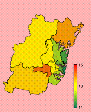
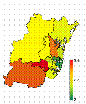
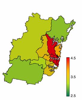
Map 2 below shows the energy intensity of Sydney households, in units of Gigajoules per dollar spent. Generally speaking, more affluent suburbs exhibit a lower energy intensity than less affluent suburbs. This is because in their consumer basket, less affluent households feature a higher percentage of energy-intensive things (such as petrol, food, cars), while more affluent housheolds feature a higher percentage of less energy-intensive things (such as personal services, banking, recreation). As a result, suburbs that are red in map 1 are green in map 2, and vice versa.
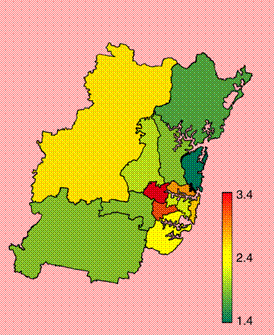
Map 3 below shows the energy requirements of Sydney households, in units of Gigajoules per capita, just for public transport (buses and trains, including manufacturing, stations, tracks etc). Generally speaking, people living around the centre use public transport most often, while people right in the centre can often walk, and people living in outer suburbs need a car because there is no adequate public transport.
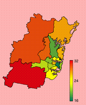
Quite the opposite picture emerges for car use: Map 4 below shows the energy requirements of Sydney households, in units of Gigajoules per capita, just for car use (including petrol, car manufacturing and maintenance, roads, etc). Generally speaking, people living in outer suburbs have to rely on their cars because there is no adequate public transport. Note that the magnitude of energy required for private cars is ten times higher than that for public transport.
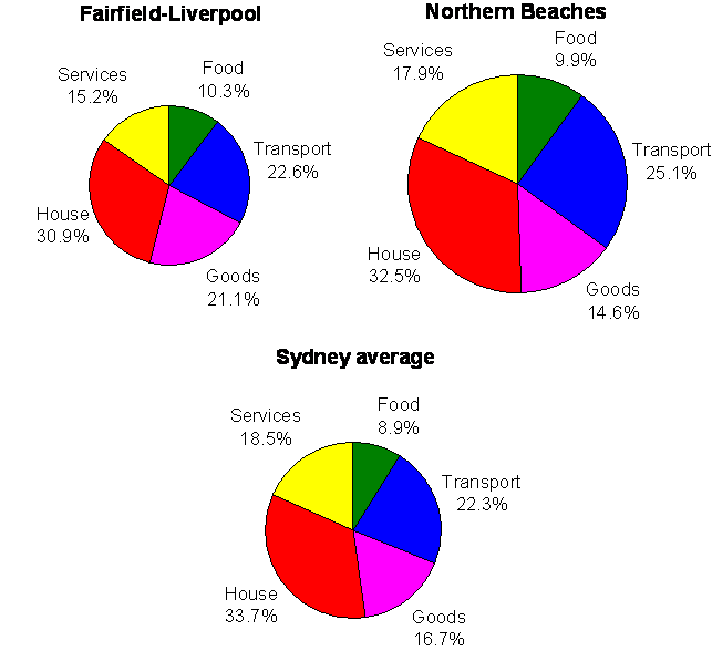
Many more commodities can be examined in this way. The piecharts below provides a breakdown of the energy requirement for the more affluent Northern Beaches, the less affluent suburb of Fairfield-Liverpool, and the Sydney average.
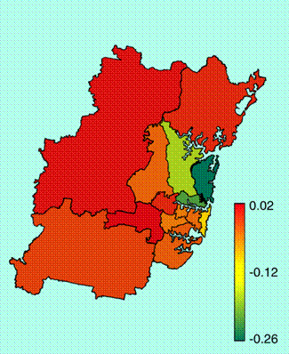
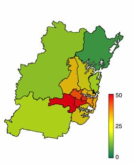
A similar exercise can be carried out for any other indicator. The following map 5 shows how many jobs are necessary to support the lives of people living in various Sydney SSDs. In the red areas (positive values), household provide less labour themselves than is needed to support their living. In the green areas (negative values), household provide more labour themselves than is needed to support their living.
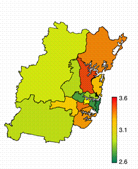
Map 6 shows one of the underlying reasons for the trend in map 5: In their consumer basket, some households feature a higher percentage of labour-intensive things (such as personal services, banking, recreation), while other housheolds feature a higher percentage of less labour-intensive things (such as petrol, food, cars.
A more detailed investigation of these trends requires a more in-depth analysis of other potential determinants of social and environmental impacts. These determinants could be
For further information please contact
|